Selecting photos for blog posts may at first seem a simple exercise. However, due to the very visual aspect of the web, image selection is a crucial part of engaging your user and shaping the overall look of your website.
Here are my tips for choosing the best images.
Firstly, establish the image definitions for your brand.
What are these? Well, as with blog posts, you define your tone and manner with the language you use, and this is also critical for imagery. The right visual language will help you to retain reader interest and engagement.
So, how do you establish your image definitions?
You could engage an art director or graphic designer to help you work these out. However, if you’re on a budget, the easiest and most cost-effective way to define your visual tone and language is to look at the brands that you love. Go to their websites and blogs and look at the images they have chosen, and use their visual cues as a guide.
Really study the images, then write down what you see in each one. Describe the subject matter and the tones and colours; are there many tones and colours, or just a few?
Is the camera angle high or low, that is, are you looking down on the subject, or up at it? Note whether it’s a wide panoramic style of image, or a square or vertical/portrait orientation.
If there are people shown, write down the age you think they are, their sex, the clothing they’re wearing, as well as what they’re doing. What is the mood and context?
After writing down the description for a couple of images, you should see a pattern of common themes emerging.
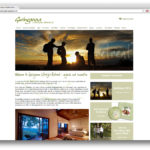
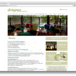
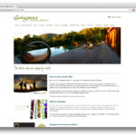
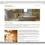
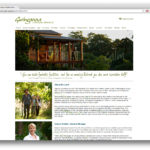
As an example, let’s look at the Gwinganna Health Retreat website.
First of all when you look across all the pages most of the images have warm, succulent, earthy tones, consisting of mainly yellow and reds through all images.
Green, brown and natural tones are used in most of the outdoor shots. The interior photographs show luxury, comfort, and plenty of space.
Where people are present, they are in the 30 to 40 year old age bracket, wearing casual, sporting clothes or in a bathrobe. The people are relaxing and exercising while enjoying their surrounds, whether it is indoors or outdoors.
Now pick out the common adjectives and keywords that you’ve used to describe the images and write them down.
Warm, succulent, red, yellows, brown natural tones, luxury, comfort, space,
30 to 40 year old woman, 30 to 40 year old man,
exercising, relaxing, casual, enjoying their surrounds, indoors and outdoors.
These are the core brand definitions for visual communications. They are the terms to use when searching for images, and they define which shots you should and should not use.
Every image on your blog should be described by one or more of your terms. These descriptors should be at the forefront of your mind when selecting images.
Once you’ve established your image search terms, use them to comb through free and paid stock libraries to find the right images for your posts. Use several of these core terms, or just one of two if you aren’t getting enough results.
I would suggest that the best way to make use of them would be in conjunction with your post’s subject matter. If you’re writing a blog post about meditation use search terms such as “meditation yellow tone outdoor female” or “meditation natural tones male”.
With your visual themes clearly defined, it will become easier to select the right images that convey the visual language and tone of your website.

Leave a Reply